Landing pages

Landing Page for Google Ads: Anatomy That Closes

Every wasted click starts the same way: the ad promised something specific, the page shrugged. Here’s the anatomy of a first screen that keeps the promise.

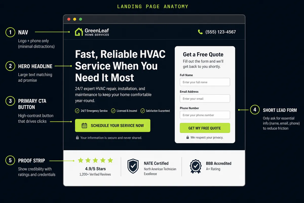
A landing page for Google Ads isn’t a prettier homepage. It’s a first screen that finishes the ad’s sentence — hero, form, CTA, and proof in one glance.

Annotated landing page anatomy for Google Ads: nav, hero headline, primary CTA, short lead form, and proof strip
  1. HeroSame promise as the ad — or they bounce.
  2. CTA + formName the win. Cut the fields.
  3. ProofStars and credentials next to the ask.

What each piece is doing

Nav — logo and phone only. Extra links are exits. If someone clicked a Search ad for a specific offer, don’t send them hunting through a menu.

Hero headline — mirror the query and the RSA. “California tax relief consult” beats “Welcome.” Message match is Quality Score and conversion rate wearing the same jacket.

Primary CTA — name the outcome (“Book my free consult”), not “Submit.” High contrast so the eye lands on the ask before the footer.

Short lead form — name, email, phone is usually enough for lead-gen. Every extra field is a tax on the click you already paid for.

Proof strip — ratings, credentials, or a concrete volume claim next to the form. Proof that lives three scrolls down doesn’t help the first decision.

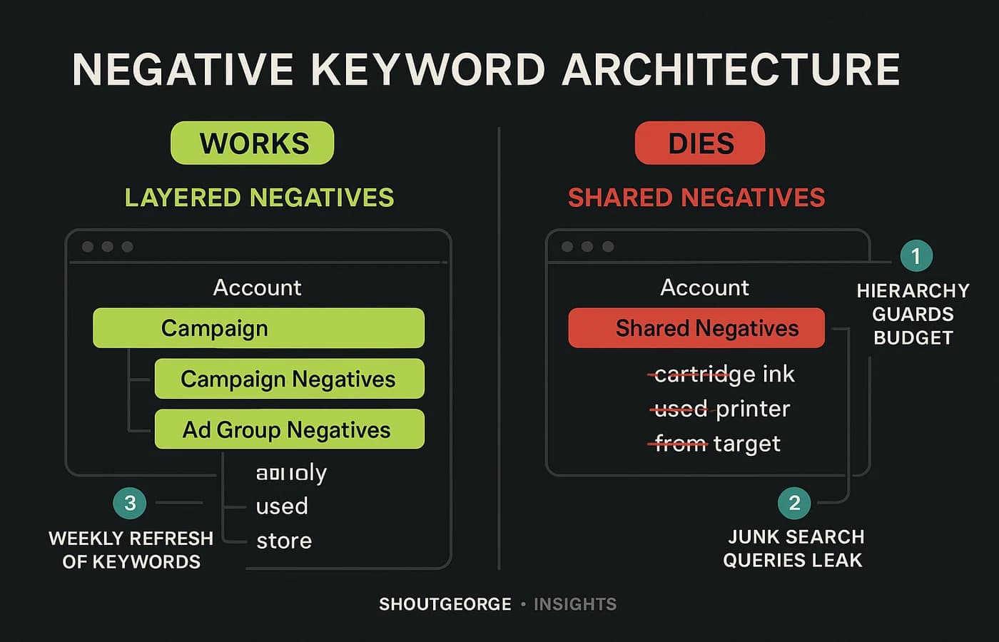
Want the side-by-side of pages that convert vs bleed budget? See Google Ads landing page: what works vs what dies. Pressure-test your eye in the Ads Eye Challenge.

Companion video · ShoutGeorgeOpen on YouTube

Message match is the whole game

If the ad says “tax relief consult in California,” the H1 should say that — not “we help families thrive.” Same offer. Same geography. Same next step. Anything vaguer is a bounce tax you chose to pay.

Operators often over-invest in RSA pins and under-invest in the page those pins send traffic to. The anatomy diagram above is the checklist: nav, hero, CTA, form, proof — each piece either keeps the click or refunds it to Google.

Forms and CTAs that close

Name the outcome (“Book my free consult”), not “Submit.” Put proof next to the ask. Keep the form short. Make the thank-you fire once. Soft CTAs and brochure layouts don’t get Soft Bid strategies forgiven — they just teach Google that your traffic doesn’t convert.

Pair with the conversion comparison

Once the anatomy is clear, pressure-test real layouts: pages that convert vs pages that die. That sibling guide targets google ads landing page patterns — works vs dies — so you can spot the brochure homepage before it burns budget.

Related operator links

Pair pages with clean Google Ads conversion tracking and landing pages & tracking services. Train your eye in the Ads Eye Challenge.
Need the page and the tracking together?

That’s the usual failure point. Email the offer, market, and whether forms or calls close the deal — or take the Ads Eye challenge to pressure-test the promise.